Widgets
From familiar widgets to three ways of offering a suggestion.
I wanted to understand what a useful SiriAI widget could offer before someone opened an app. Could a single question be enough, or would an explanation or a set of actions be more useful? I studied familiar widgets, then built three directions to explore those choices.
Studying familiar widgets
I compared each widget at different sizes and appearances, looking at what it kept, what it added, and what it asked me to notice first.
The content decides what comes first
I measured 78 layouts across 30 widget families. The outer shapes were consistent: every sampled container used 27 px corners with 60% smoothing. Inside that shape, the priorities changed. Weather led with a temperature; Calendar grouped events; Music gave artwork and playback room.
Size was a change in composition. Larger widgets could add context, make a single idea more prominent, or offer more actions. That became my starting point: decide what someone should get from a glance, then give it the space it needs.
Three ways to offer a suggestion
I chose Journal, Tips, and Shortcuts because they answer that question in different ways. I kept their layouts, typography, colors, and controls, then wrote prompts that fit each role.
Reflect stays with one question as the widget grows. Discover adds explanation and imagery. Act adds more tiles. Their colors reinforce those differences: Journal’s gradient, Tips’ yellow, and Shortcuts’ bright actions.
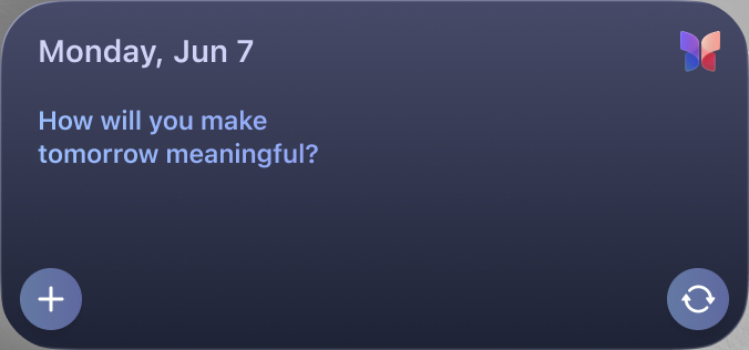

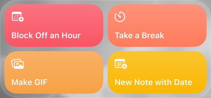
Try the three directions
Compare Reflect, Discover, and Act at different sizes and appearances.
The useful pattern was deciding how much to ask of someone: a moment of reflection, a little guidance, or a ready starting point. The widget’s hierarchy, color, and behavior follow from that choice.